Tuesday, September 29, 2009
Visual Language
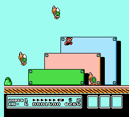
The visual message communicated through this screenshot of Super Mario Bros. 3 is that it is a dynamic playful environment for various characters. With different pastel colors, the image visually communicates the playfulness. There is also motion in the image as there are three different characters floating in the air. The rectangles and the overlapping of characters and objects give us a sense of dimension in the world the image is depicting. The image makes use of symbols visual intelligence also. Most of the bottom of the image is made up of various symbols made up of letters and numbers.
In a video game screen shot, the character you are controlling is typically in the center of the screen. Also, video games usually have a heads-up display to show the user information about the current status of your progress within the game.
Sunday, September 20, 2009
Visual Thinking Research
The first puzzle I chose was Starry Sky. Unfortunately, I was not able to solve this puzzle and always ended up with one star missing. I kept trying different ways to connect the stars to see if I could eventually get all the stars with six lines. I tried both diagonals and straight lines. The image above is one of my attempts at solving the puzzle.
After sharing results with my friend, we realized we were both unable to solve the puzzle. She also had one star missing most of the time and the above is the one she got closest to. We both were missing the same star at the end. She said she was trying to use the lines to get the most stars possible and never stopped short. The answer was to make longer lines that extended passed the edge of the stars to get it under six lines.
For the second puzzle, I tried a counting the triangles that is similar to the counting the squares in class puzzle. The strategy I used here was to count all the smallest triangles, then moved up to the next biggest one, and kept going like that until I got to the largest triangles. Totally, I got 32 triangles but the answer was actually 44 triangles.
My friend got the correct number of triangles. She said she also counted the smallest triangles first and then went up to the larger ones. I found what I was missing: I forgot to reverse the triangles for the medium sized triangles to double count them.
Tuesday, September 15, 2009
Feature Channels and Visual Search
The design of this informational poster uses both feature channels and visual search concepts. There are only two colors here but they work effectively in making certain elements pop-out to direct the attention to different significant information the viewer needs to know. The date and time are most important so they use white to pop-out the most, helping in the visual search. The images and typography both use shape as a feature channel. Size is another feature channel used to contrast different information on the poster. The type uses density to make it pop-out from the rest of the poster. Visual search is used in the design because the most significant information, the date and time makes use of preattentive processing.
Image Source: http://www.35mmdesign.com/portfolio/print/poster_tct_glasshouse.jpg
Tuesday, September 8, 2009
Top Down Visual Processing
This is a map of the San Francisco State University campus and it is related to top down visual processing because it causes goal directed eye movement: the user will look at the map with a purpose in mind such as locating a building. The eye movements will constantly be moving around the map to fixate at yellow spots that are buildings to see if it is the correct one, ignoring green fields. It also involves priming of action plans because the user will ultimately use the map to find the best direction to their building. For example, the person looking at the map will probably not only locate the building they are looking for, but their current location on the map. This person will probably keep looking back and forth to trace a good direction to get to their destination.
Image Source: http://www.sfsu.edu/~news/announce/smokemap_zoomin.jpg
Subscribe to:
Posts (Atom)